Travel Expo
BRANDING | EXPERIENTIAL | SOCIAL MEDIA
OVERVIEW OF DESIGN CHOICES
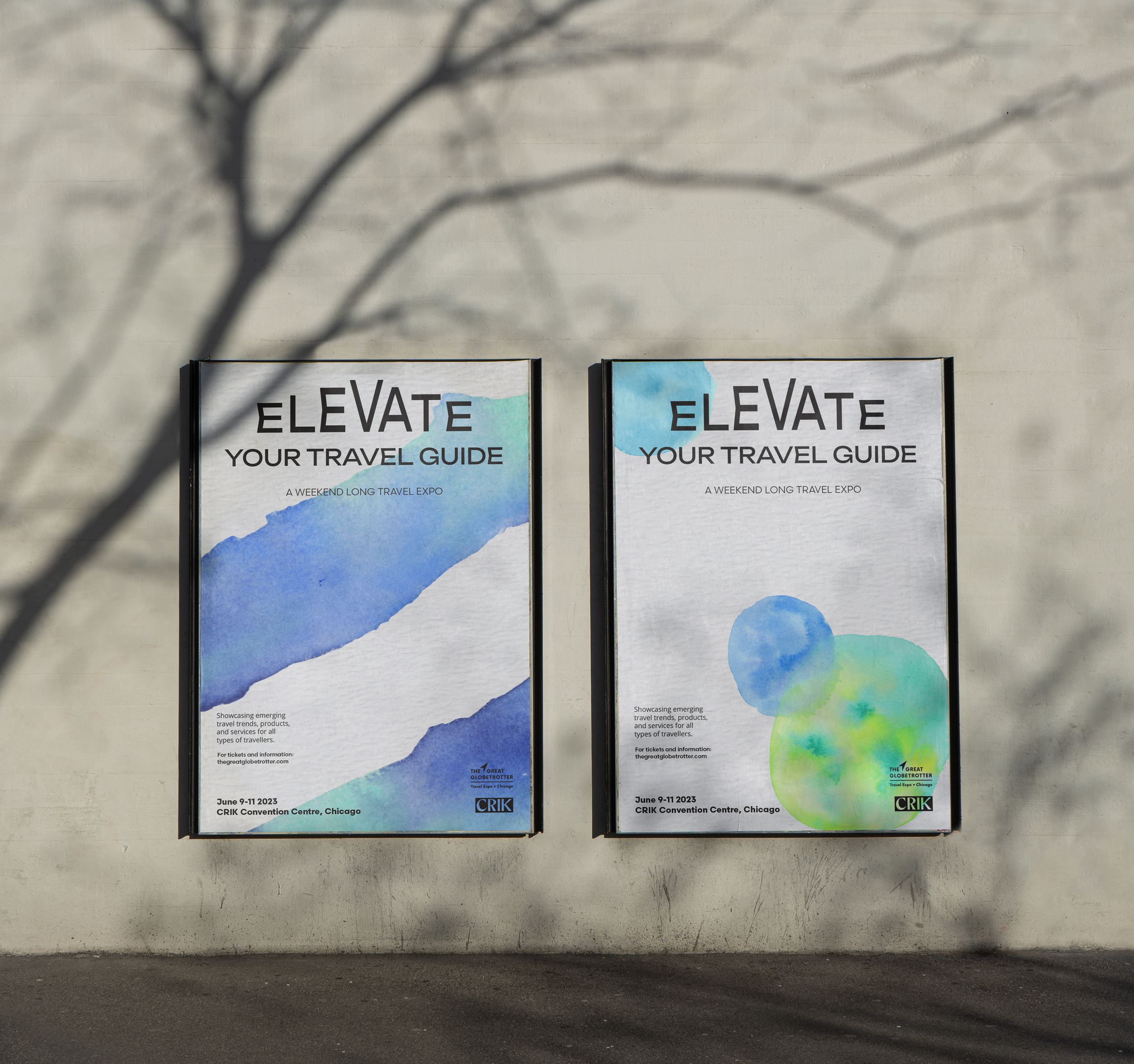
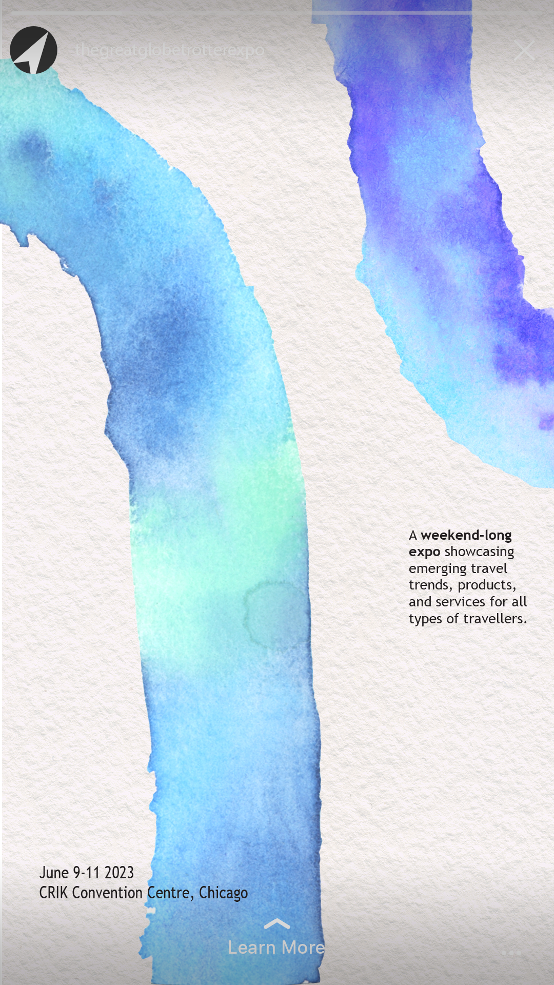
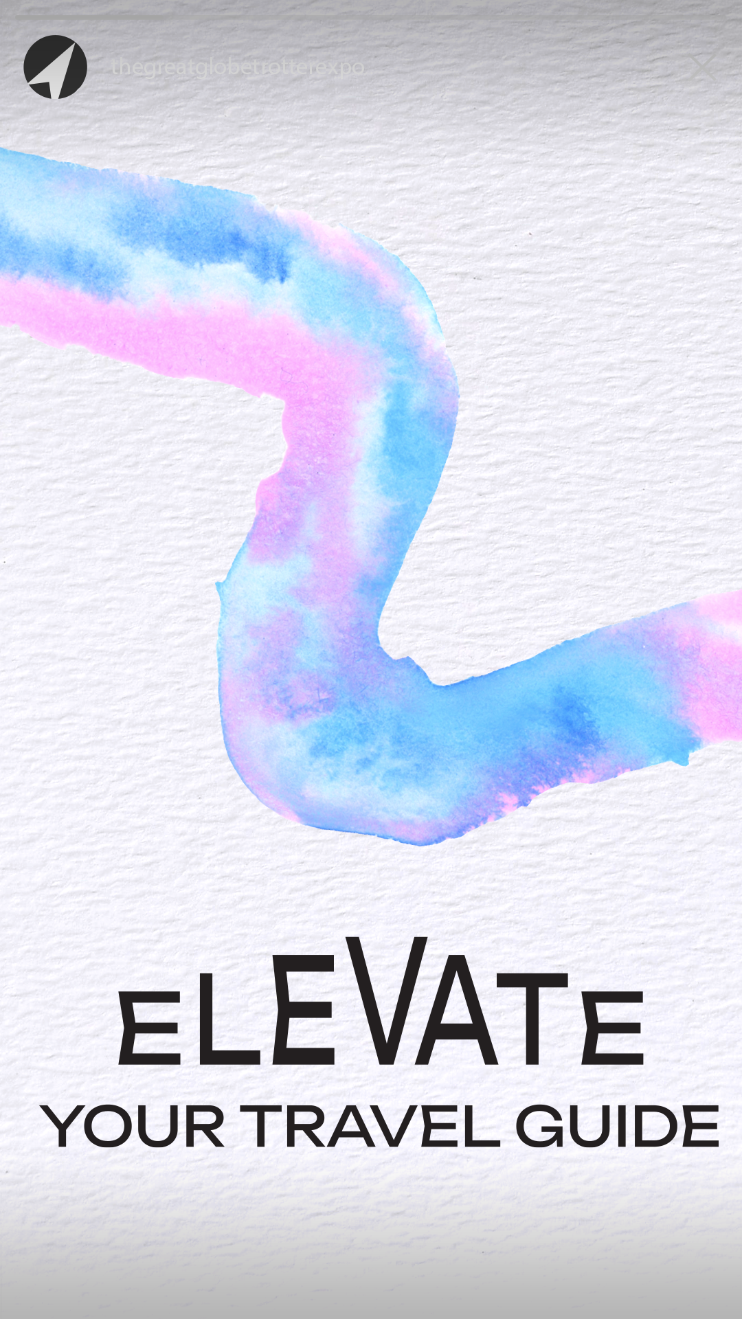
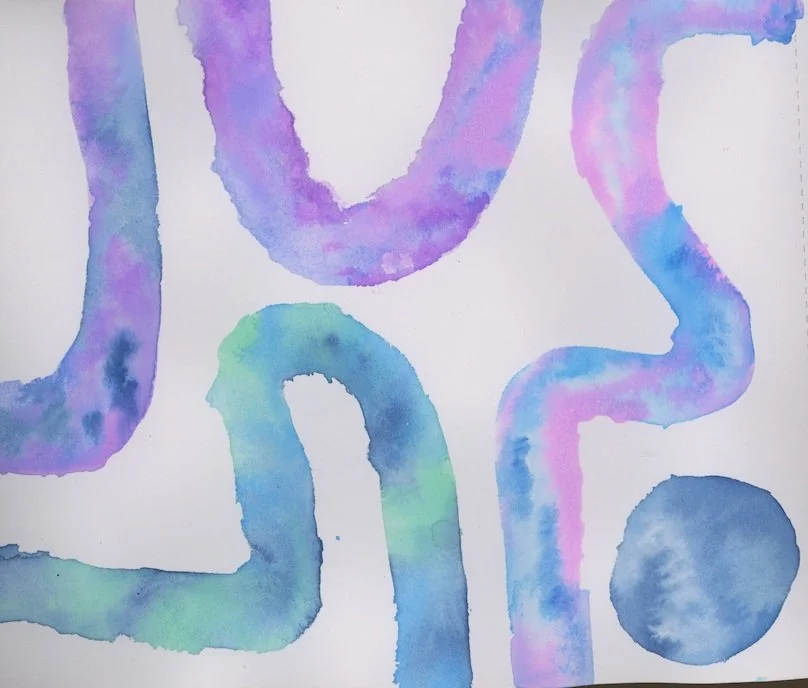
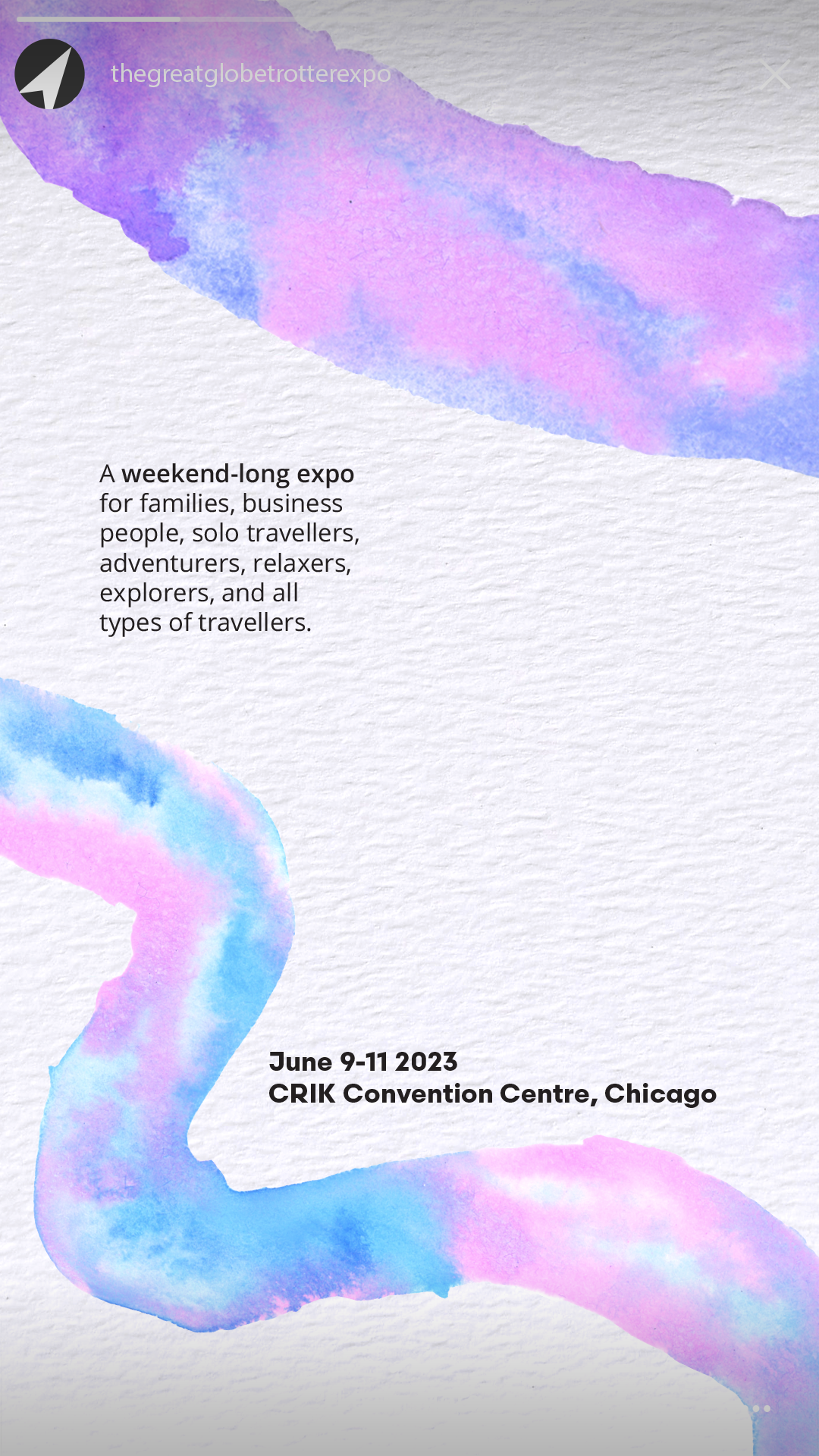
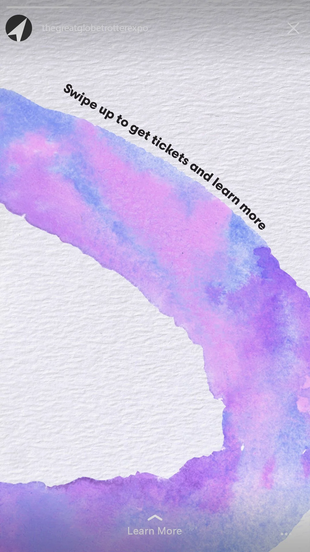
I used watercolor paints as a way to represent feelings of calm and relaxation. The bleeding paints that flow easily from one hue to the next to allude to the sensation of letting go and moving with the flow, inviting a sense of ease.
Additionally, I stuck to a palette of cool colors like shades of blue and purple to further reduce tension and stress.
I also represented the idea of “going with the flow” by creating a series of Instagram stories where the graphic elements flow between frames.
RESEARCH
After a review of competing travel expos, I concluded the events were crowded, hectic and chaotic. I wanted this event to stand out for the way it would exemplify relaxation, so it feels to attendees that they are already on vacation.

