Cafe con Libros
BRANDING | EXPERIENTIAL | PACKAGING
OVERVIEW OF DESIGN CHOICES
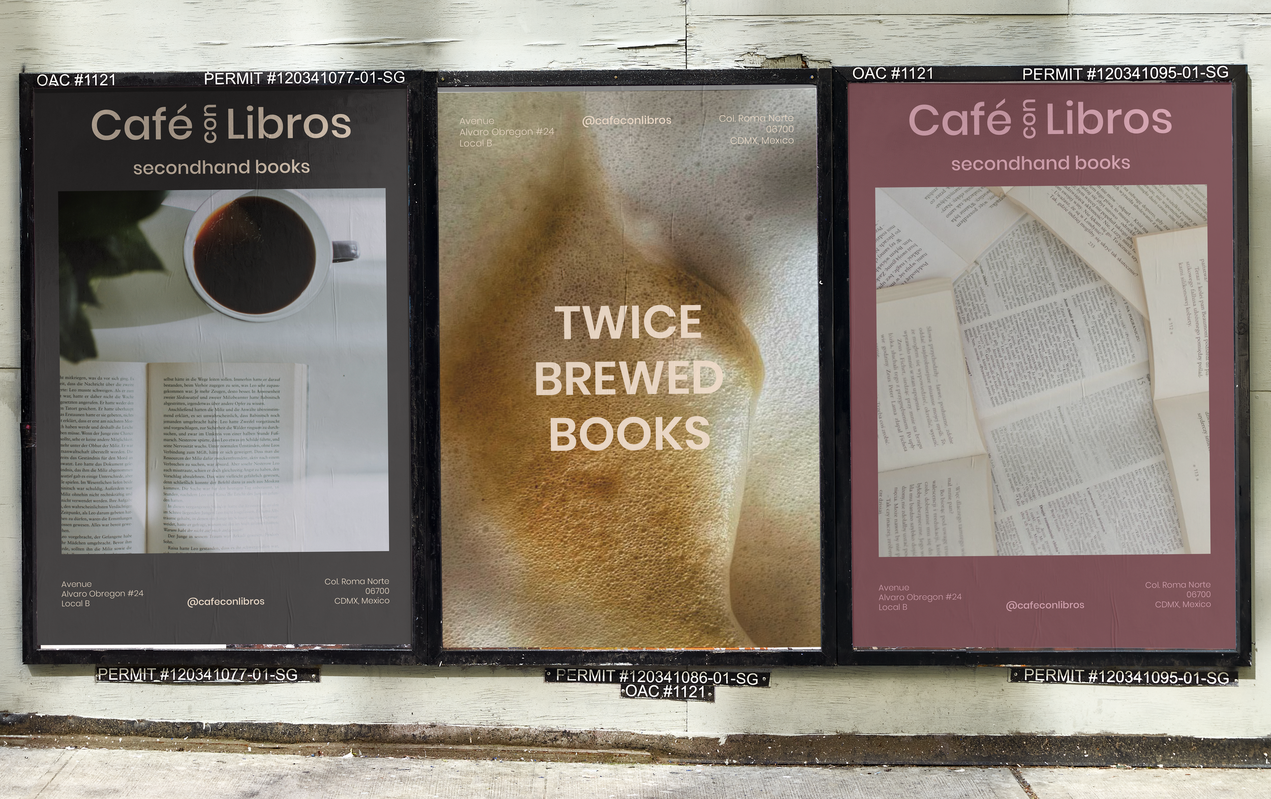
To complement the richness of La Roma, I developed a simple logo that relies on a bold sans-serif and neutral color palette
The clean lines and gentle curves of the sans-serif gently guide the eyes to the establishment, and the neutral color palette gives the eye a comfortable place to rest.
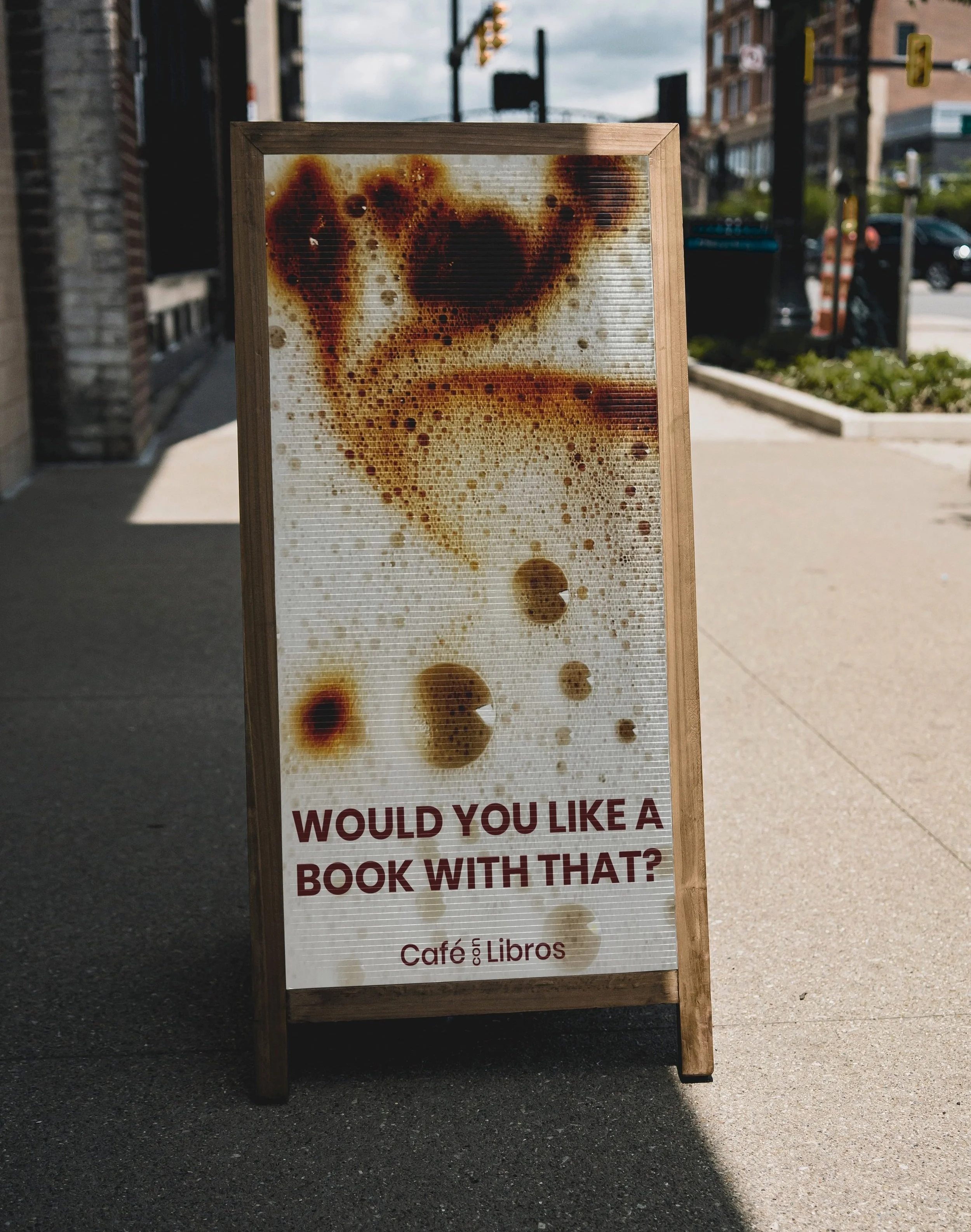
Additional visual language for image direction includes references to turning pages, creased and crumpled pages to allude to the previous lives the secondhand books have had, and close-up macro shots to emphasize the quiet contentment patrons may get from reading while enjoying a beverage.
RESEARCH
To create a name, logo, brand voice, and visual language for a secondhand bookstore and coffeeshop that would also serve as a community venue, I began with a competitive analysis of competing bookstores in Mexico City. In my survey, I found that the stores attracted a clientele of community-conscious readers who wanted to engage locally in their neighborhoods
Thus, it was important for me to consider the neighborhood where this coffeeshop/bookstore would be based. The La Roma neighborhood in Mexico City is full of colorful buildings, ornate ironwork, lush vegetation, and overall creates a visually full neighborhood.


